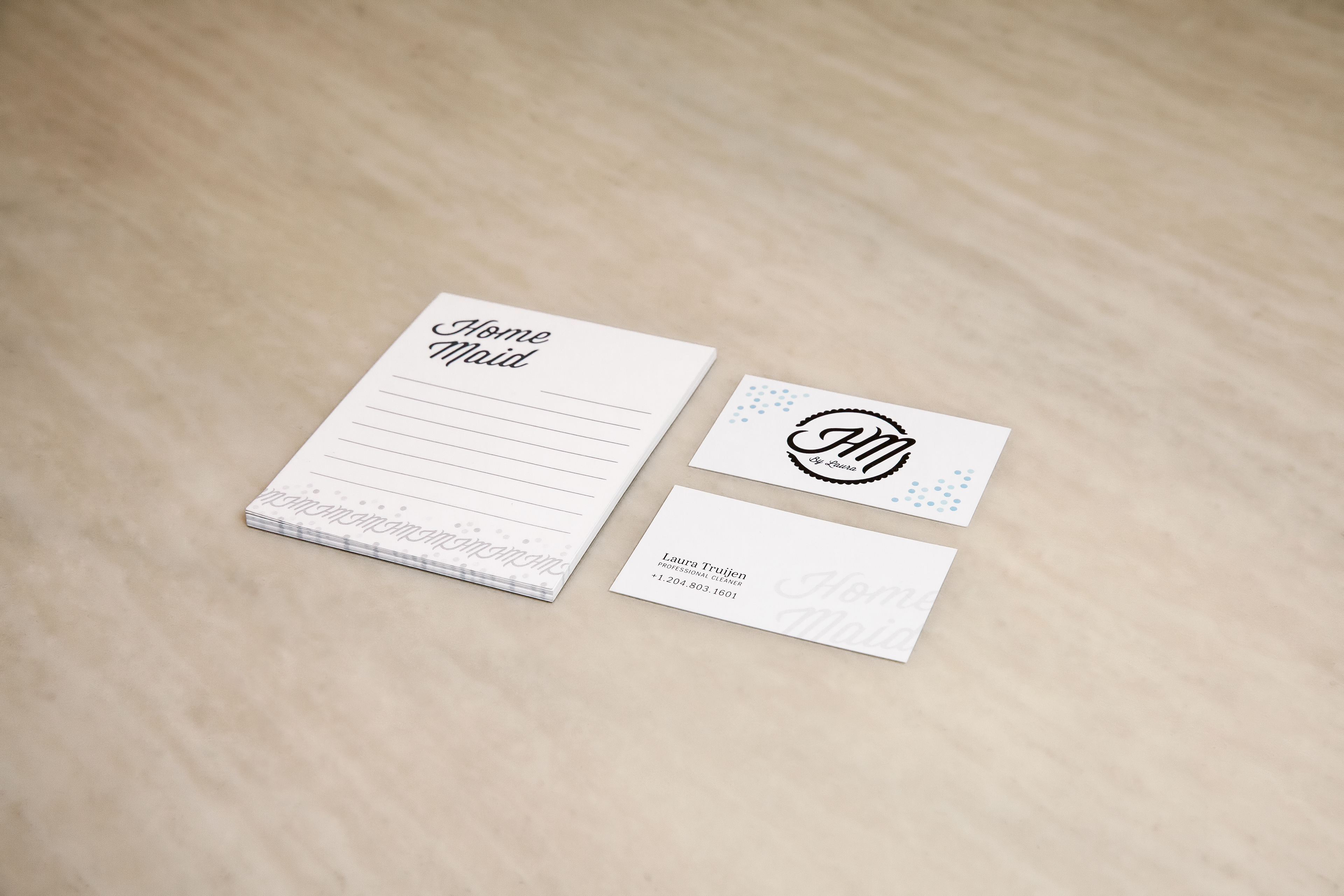
Home Maid was a small and independent home cleaning business based out of Winnipeg, Manitoba. It was desired that the logo have a strong “homemade” feeling to it while maintaining ideas like sustainability, authenticity, and warmth. The brand was targeted at mothers with children who don't have enough time to clean everyday between driving their kids to soccer practice and piano lessons. The brand colours were kept light and bubbly while the logo mark designed to carry a similar atheistic to a doily.
Stationary
Above all else, the stationary was designed to look clean and inviting, as something that would be recognisable and non-intrusive in any home. It is also produced using recycled and compostable materials to be in line with the brands sustainable mandate. Custom labels were made for cleaning fluids to maintain brand consistency even through the day to day workflow. The cleaning products are homemade using organic, all natural, and hypoallergenic ingredients.


Branding Imagery
The imagery for the brand displays wide open spaces of unique and colourful and clean homes. These images are diverse, capture the viewers attention, and makes them wonder how great their place could look too if it was clean.


Development Summary
Developing the logo started out with a series of sketches that encompassed the logo's key visual language of friendly, affordable, and flexible while also maintaining the brands image of warm, authentic and sustainable. Different variations of leaves and homes were drawn but that didn't blend well with the brands "home-maid" name pun. While sitting at my grandmas place and watching her work on a doily, I realised that the style and shape of a doily was not just recognisable, but also provided the proper imagery that we were looking for. After that, the logo went through a series of revisions to make it friendlier and more organic. No sharp points or edges were left and everything was rounded off in a safe and friendly fashion.