Tall Crane Equipment is Vancouver’s Leading Tower Crane and Licensed Elevator Contractor Providing Personnel Hoist Rentals. Since the company's inception in the 1980s, they were operating with the same brand imagery that they started with. Needless to say, in the last 40 years a lot has changed, so they were looking for an update to help reflect the internal culture and values their company promoted.
LAYING THE FOUNDATIONS: STYLE DECK
Before diving headfirst into the deep waters of branding, it's essential to take a step back and view the broader ocean. I, Robert, believe in the philosophy of intention before action. My first port of call with Tall Crane Equipment was not the logo itself, but the world around it — we began with a meticulously crafted style deck.
Understanding the Audience: It's imperative to know for whom we're designing. In Tall Crane's unique scenario, the primary audience was their employees — the backbone of the company. Recognizing their demographics, preferences, and aspirations ensured that the new brand resonated at a personal level. This wasn't just about a corporate refresh; it was a homage to the individuals who make the company what it is.
Defining the Brand Lexicon: Words are powerful tools in the design process. I collaborated closely with Tall Crane to distill keywords that truly encapsulated their ethos. These words became our North Star, guiding every design choice we made.
A Palette with Purpose: Colours evoke emotion and perception. For Tall Crane, I needed a palette that mirrored their strength, reliability, and growth trajectory. I didn't just pick hues; I selected colours that narrated their story.
Imagery that Inspires: A picture is worth a thousand words, especially in design. I curated a collection of imagery — each one handpicked to reflect the dynamism and grandeur of Tall Crane. These visuals weren't mere embellishments; they were essential threads in the tapestry of the brand's new narrative.
Building a brand is akin to constructing a building; it needs a solid foundation to stand tall and withstand the test of time. The style deck was our blueprint, ensuring that every brick laid in the branding process for Tall Crane was purposeful, impactful, and timeless.
DECODING THE LOGO: A FUSION OF FUNCTION & FORM
The design process, especially for a brand that has woven itself into the fabric of Vancouver's skyline, is an intricate dance of balance. Every logo tells a story, and with Tall Crane, I ensured every chapter was crafted to perfection. Here's the breakdown of the narrative that forms the crux of their brand identity:
Timelessness Meets Abstraction: In an ever-evolving design landscape, the aspiration was for longevity. The abstract nature of the logo, while mysterious at first glance, is an invitation for deeper introspection. It's a design that stands resolute amidst fleeting trends.
Strength in Geometry: The logo isn't just about shapes; it's about the narrative they form. The consistent geometric forms resonate with the robustness and reliability that Tall Crane has been synonymous with.
Elegance in the Everyday: At the intersection of utility and sophistication lies our design. The ruby-like contour, juxtaposed with its sharp edges, lends that touch of opulence. It's a testament that utility doesn't preclude elegance.
Silhouettes Speaking Volumes: The beauty of negative space is its silent eloquence. The isometric building not only nods to the construction realm but hides a crane within, carved from the viewpoint of the everyday observer — gazing up in awe.
Typography as a Testament: The chosen type isn’t just about aesthetics; it echoes the brand's character. The tall stance, the straight edges, and the distinct 'Q' all harmoniously blend, reminiscent of the industry's unique elements, especially the quintessential crane cable that hangs from the boxy hoist.
The Iterative Journey: Using our style deck as the foundational compass, the design journey began with numerous hand-drawn iterations. Presented to the client, each sketch was a potential future for Tall Crane's brand story. Narrowing down to three, these were meticulously digitalized, honing in on details. And then, with the client's alignment, the chosen one underwent its final metamorphosis, emerging as the polished emblem we see today.
Every aspect of this logo, every line and curve, is more than just design. It's a chapter in the Tall Crane saga — one of legacy, innovation, and an unwavering commitment to excellence.
BUSINESS CARDS: DISTINCTION IN EVERY DETAIL
In today's digitized world, the tactile sensation of holding a business card, feeling its texture and seeing its design, remains an unparalleled experience. For Tall Crane, a company steeped in history yet looking to the future, the business cards were more than just a means to share contact details — they were an embodiment of the brand itself.
Exploring the Aesthetic: Multiple design iterations were conceptualized to ensure that the business cards captured the essence of Tall Crane. Every version was an expression of the brand’s values, its history, and its forward momentum.
Metal: One of the final contenders was a metallic version — a card that shimmered with a sophisticated gleam, subtly echoing the sturdy metal structures of the cranes that the company specializes in. This design was a nod to the industry, marrying durability with a touch of luxury.
Noir Excellence with a Pop: The other version that stood out was a bold, all-black design. The choice of black symbolized strength, elegance, and timelessness. Yet, it wasn’t just any black card. Accents of orange, a hue extracted directly from the Tall Crane branding, adorned the card, offering a jolt of energy and vibrancy. These highlights were strategic, ensuring that the card wasn't just striking but was also instantly recognizable as Tall Crane's.
The Final Choice: While both designs held their own allure, the all-black with orange highlights was the chosen one. It perfectly captured the balance the company aimed for: a blend of steadfast tradition with a pulse of modern innovation.
This wasn’t just about designing a business card; it was about creating a tangible piece of Tall Crane’s brand story. A card that, when handed over, wouldn’t just share a name or a number, but would offer a glimpse into the world of Tall Crane — its ethos, its vision, and its unwavering commitment to excellence.
CATALOGUE: PERSONALIZING THE BRAND FOR ITS PILLARS
At the heart of every successful company are its employees — the very pillars that uphold its mission, vision, and values. For Tall Crane, celebrating its brand wasn't merely about external projection; it was about internal immersion. So, what better way to allow the brand to resonate with its workforce than through personalized attire?
The Catalogue Philosophy: The idea wasn’t just to create a collection but to build a bridge — one that connected the brand with its employees on a personal level. The objective was to give each employee a piece of Tall Crane they could wear, embody, and proudly showcase.
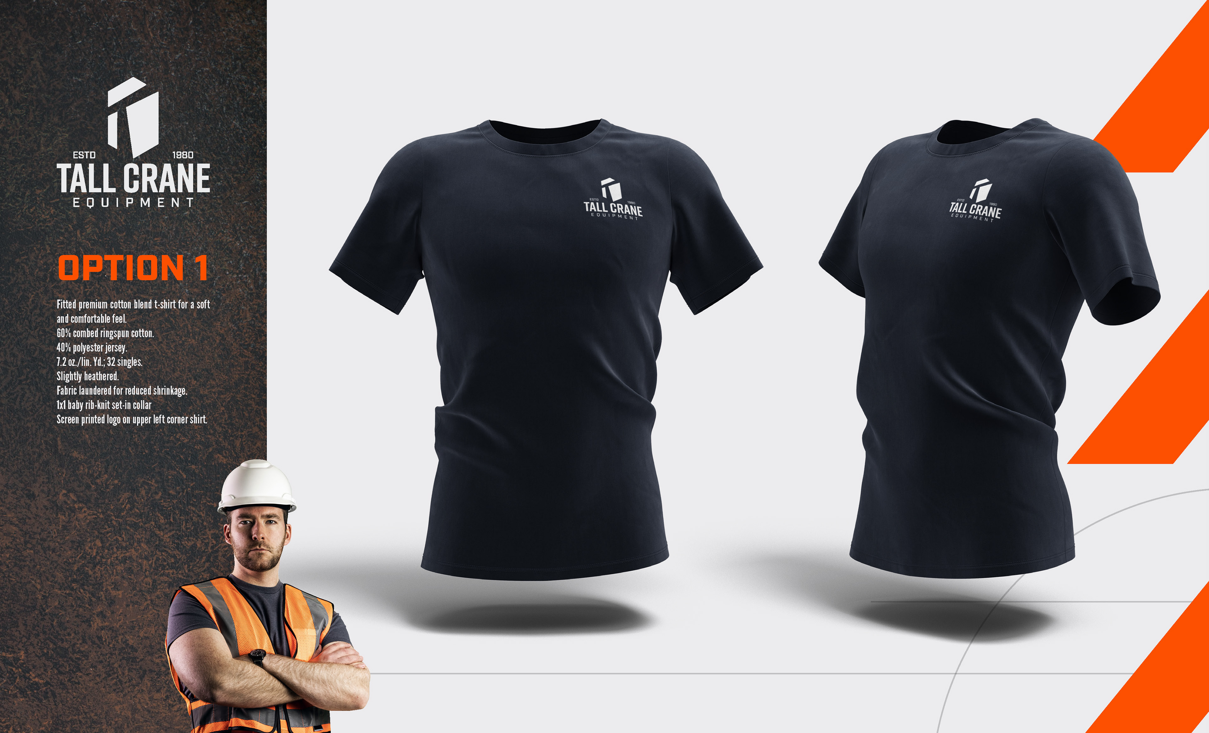
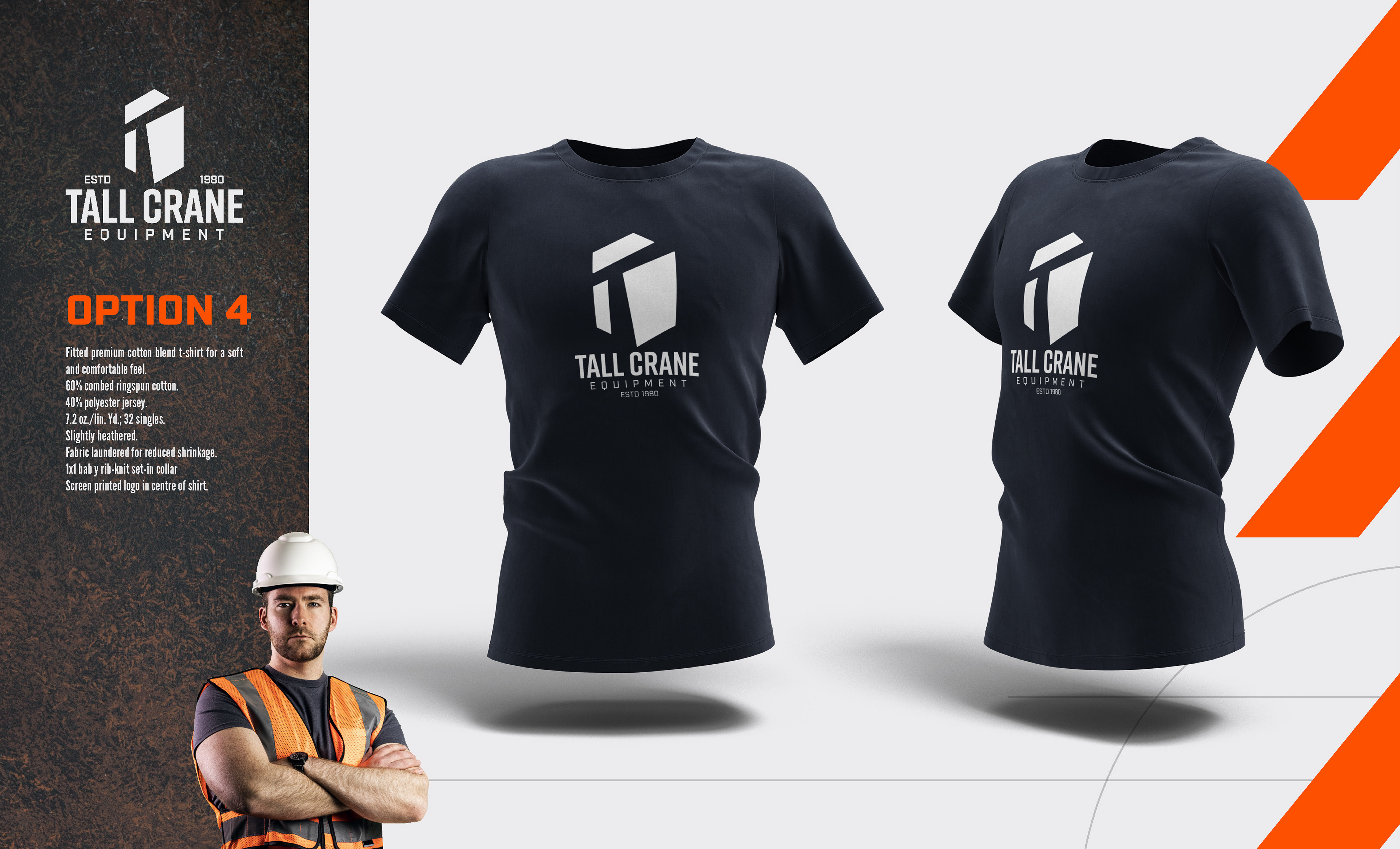
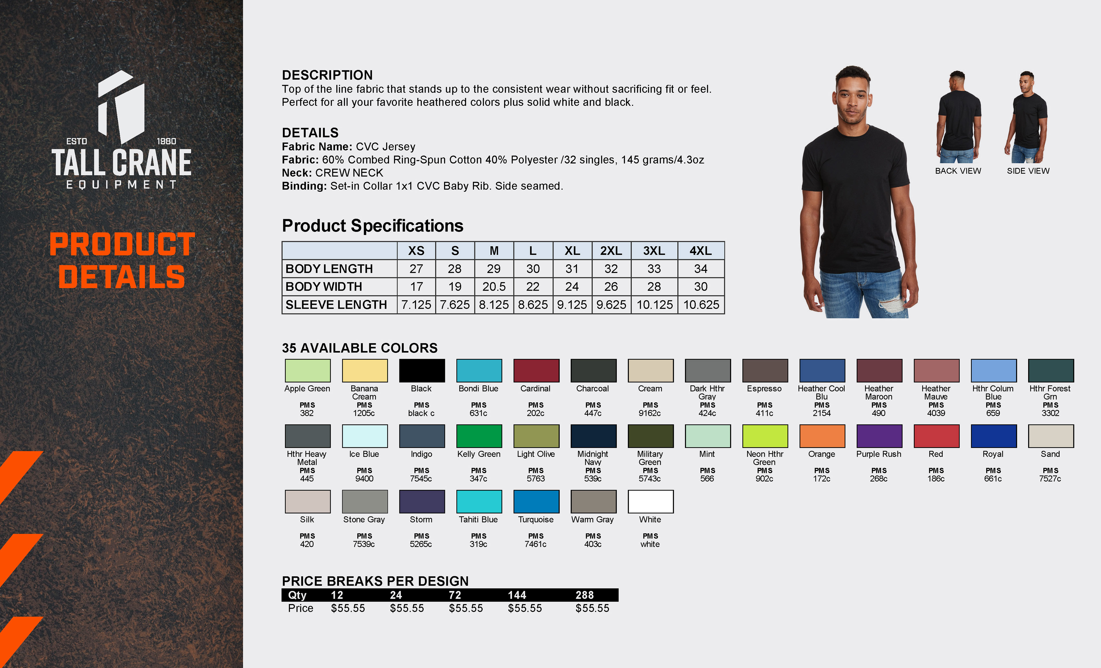
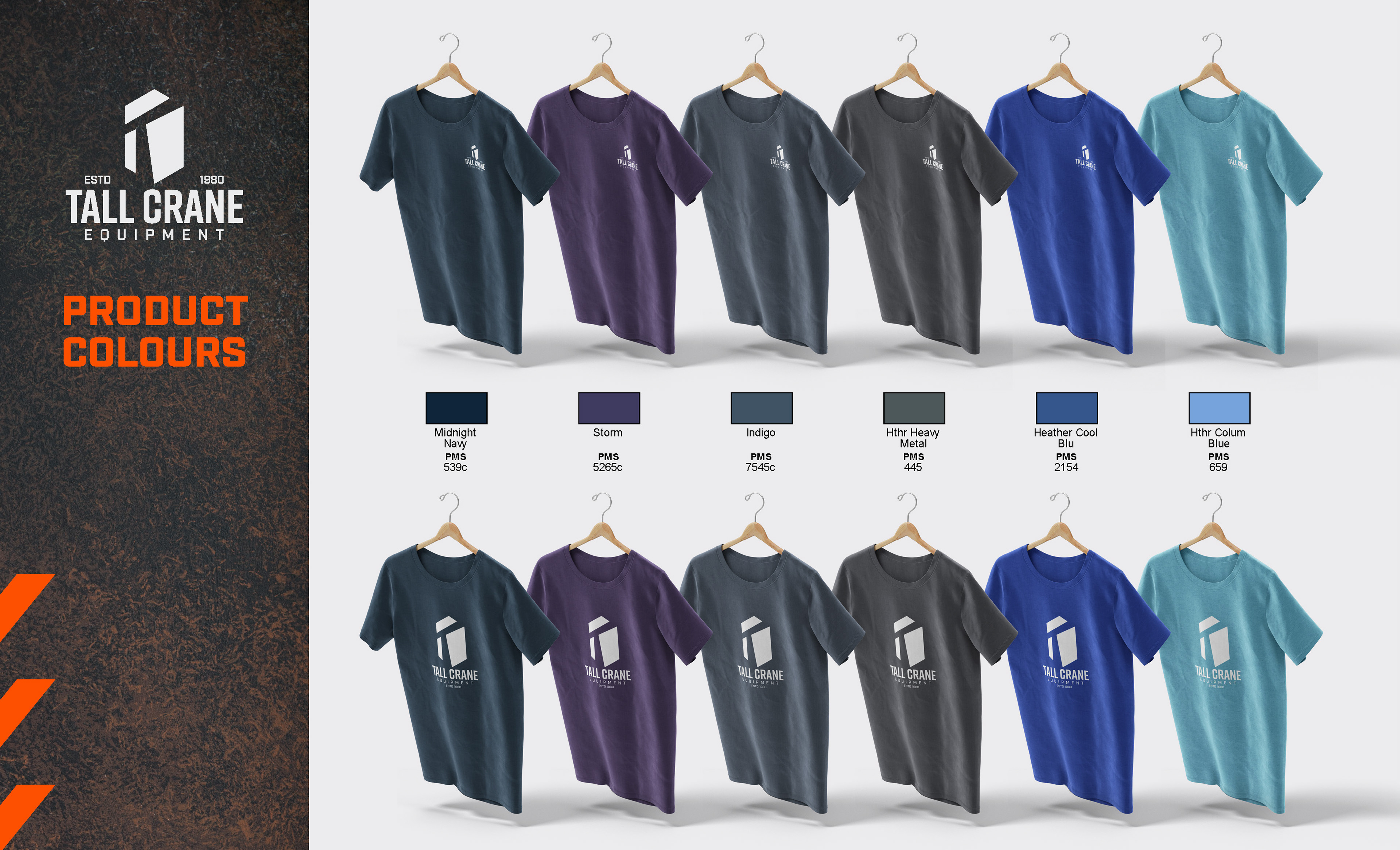
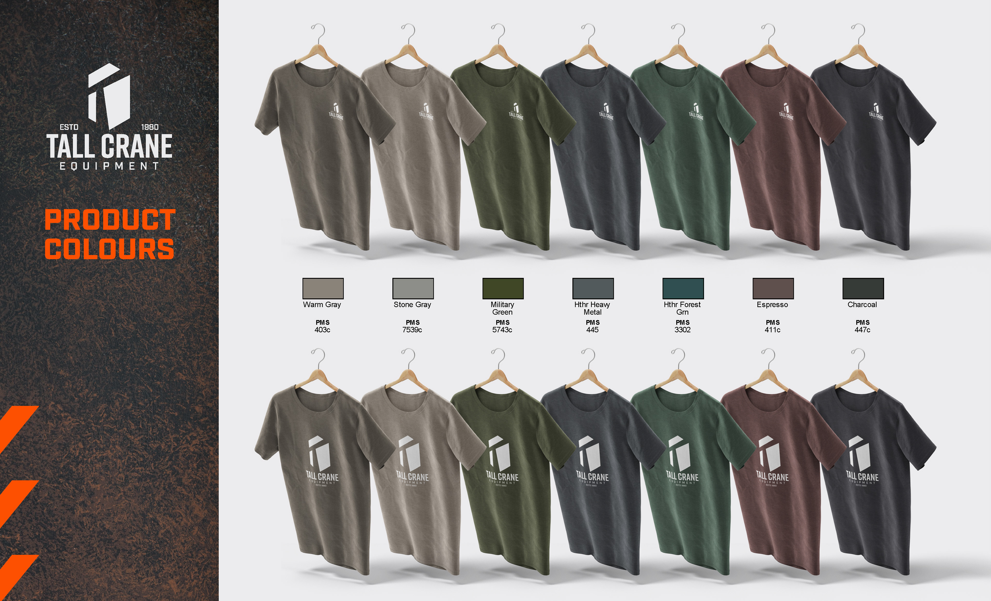
A Feast of Choices: Recognizing the uniqueness of every employee, the catalogue wasn't a one-size-fits-all. Instead, it presented a spectrum of options — shirts, jackets, and hats. Each item, while distinct in form, carried the unmistakable mark of Tall Crane, ensuring uniformity in diversity. Each item was chosen and designed knowing that the employees could wear these not just on their job sites, but in their day-to-day lives as well.
Design with a Purpose: The catalogue didn't just list products; it told a story. Crafted with the Tall Crane brand aesthetics at its core, every page, image, and layout choice echoed the brand's ethos. The design wasn't just about aesthetics; it was about aligning with the company's values, using visual storytelling to make the brand palpable.
Empowerment through Personalization: By allowing employees to choose, Tall Crane was sending out a clear message: the brand is as much theirs as it is the company's. This gesture, amplified by the company bearing the cost, underscored the importance of employees in the brand narrative.
A Seamless Integration: The catalogue wasn’t an afterthought; it was a strategic move. By integrating brand identity with employee attire, Tall Crane was blurring the lines between corporate and personal, making the brand a daily lived experience.
In essence, the Tall Crane catalogue wasn’t just a booklet of branded apparel. It was an invitation, a celebration, and most importantly, a testament to the company's belief that its true strength lies in its people. It was a tangible expression of appreciation, letting every employee wear their pride, quite literally, on their sleeve.